Our Journey: From Drafting Tables to Digital Mastery

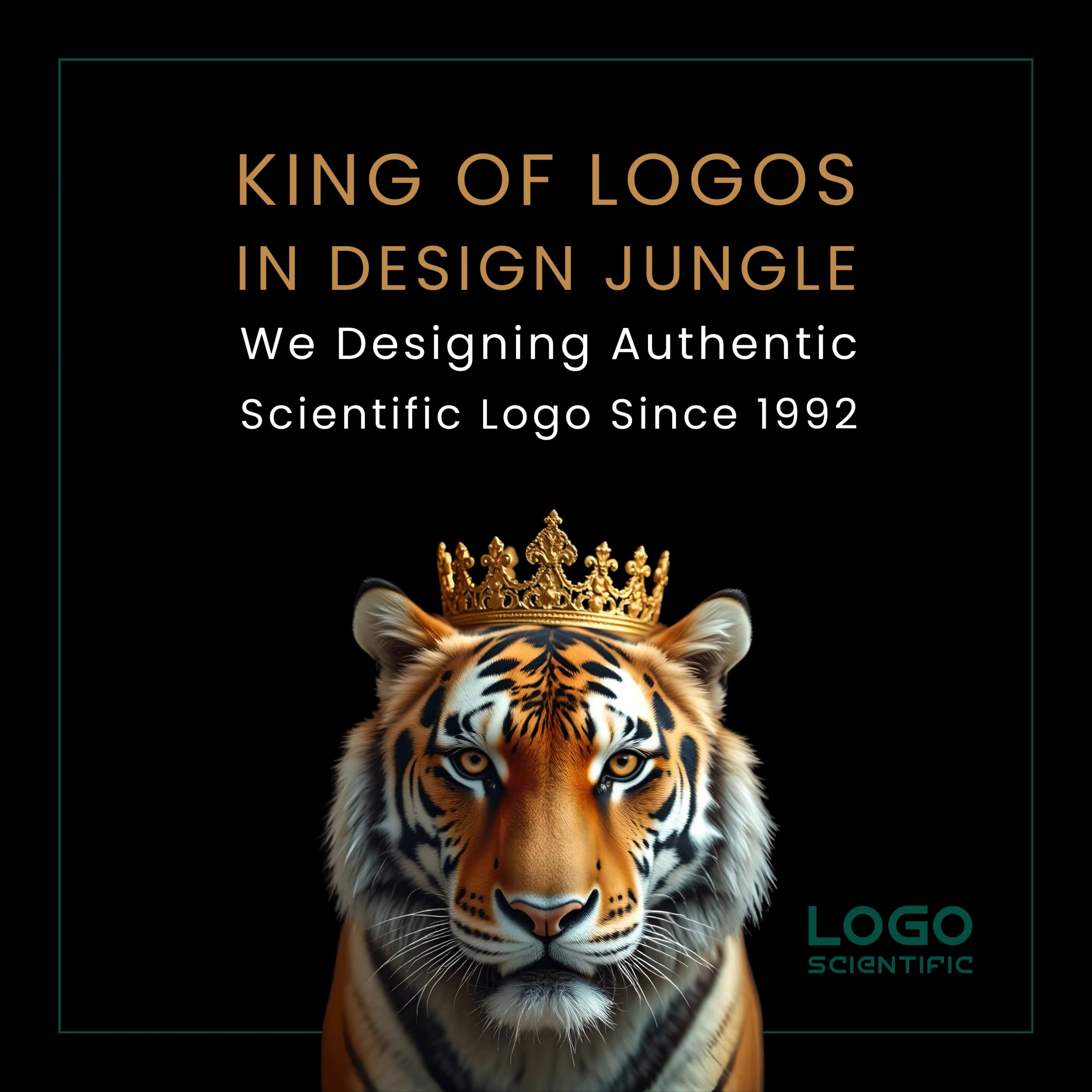
LOGO WHEN COMPUTER WASN'T SO FAMILIAR
At Logo Scientific, we began our journey in 1992, long before computers became standard in design. Back then, every logo was handcrafted using tools like parallel boards, scales, pencils, and watercolors. Once drafted, designs were developed into positive and negative photo prints on photo paper, achieving remarkable detail without digital intervention.

THE EVOLUTIONARY LOGO WITH COMPUTER
At Logo Scientific, with the advent of computer design tools in the late 90s, we adapted while preserving our foundation of manual calculation and cosmic insight. We merged digital creativity with traditional wisdom, resulting in a hybrid method that remains unique to Logo Scientific. Even today, our logos are built on decades of hands-on experience, involving meticulous manual calculations on hundreds of pages, to ensure energetic precision and measurable outcomes.
WhAT OUR CLIENTS HAVE TO SAY

Our logo was the game-changer for our company's journey
From local clinic to online clinic startup: I saw both worlds in one design process
Our logo was the game-changer for our company's journey
⭐⭐⭐⭐⭐
We were a startup company in the car lighting industry, and at the time, our brand identity was not clearly defined. Under the guidance of our team, we reached out to Logo Scientific in India, seeking a logo that combined aesthetic appeal with sun and light's deeper meaning. What they delivered was truly remarkable. They carefull
⭐⭐⭐⭐⭐
We were a startup company in the car lighting industry, and at the time, our brand identity was not clearly defined. Under the guidance of our team, we reached out to Logo Scientific in India, seeking a logo that combined aesthetic appeal with sun and light's deeper meaning. What they delivered was truly remarkable. They carefully considered the birth details of both me and my business partner, as well as the timing of our company’s launch and its name. The result was a comprehensive report of over 400 pages. After implementing their recommendations, our packaging, branding, and presence were completely transformed. Many of our clients mentioned that they could "feel" something positive from our new logo. We are sincerely grateful for their exceptional work.
Our logo 'felt sacred', that changed everything
From local clinic to online clinic startup: I saw both worlds in one design process
Our logo was the game-changer for our company's journey
⭐⭐⭐⭐⭐
We rebranded our agency with Logo Scientific. When I first laid eyes on the final logo, I got goosebumps—it had a elephant pattern subtly woven in, perfectly aligned with planetary geometry and numerology. Since its launch, we've experienced an increase in foot traffic and client base. More significantly, we feel energetically in
⭐⭐⭐⭐⭐
We rebranded our agency with Logo Scientific. When I first laid eyes on the final logo, I got goosebumps—it had a elephant pattern subtly woven in, perfectly aligned with planetary geometry and numerology. Since its launch, we've experienced an increase in foot traffic and client base. More significantly, we feel energetically in sync. The team even told us why some color, shape and angles would draw healing vibrations. Our new logo is now our brand agency's symbol of blessing.
From local clinic to online clinic startup: I saw both worlds in one design process
From local clinic to online clinic startup: I saw both worlds in one design process
From local clinic to online clinic startup: I saw both worlds in one design process
⭐⭐⭐⭐⭐
As a naturopathic doctor, I’ve always been deeply attuned to nature and the flow of energy. What impressed me most about Logo Scientific was how they combined ancient drafting techniques with modern software. They explained that the original concept was first sketched using parallel boards and precise measurements, then enhanced dig
⭐⭐⭐⭐⭐
As a naturopathic doctor, I’ve always been deeply attuned to nature and the flow of energy. What impressed me most about Logo Scientific was how they combined ancient drafting techniques with modern software. They explained that the original concept was first sketched using parallel boards and precise measurements, then enhanced digitally through sacred geometry. The mathematical work alone filled two binders. Today, our new logo sits proudly on the door of our office—and clients frequently inquire, "Who designed this?"
It has bred a professional but firmly grounded presence
From local clinic to online clinic startup: I saw both worlds in one design process
From local clinic to online clinic startup: I saw both worlds in one design process
⭐⭐⭐⭐⭐
We operate in classical dairy products, and therefore needed a name and logo that wasn't merely corporate—but also reflected meaningful presence. Logo Scientific came up with a design that drew on Vedic Astrology, Mayan astrology and Vedic numerology, perfectly in tune with our vision and mission. They even scheduled the launch f
⭐⭐⭐⭐⭐
We operate in classical dairy products, and therefore needed a name and logo that wasn't merely corporate—but also reflected meaningful presence. Logo Scientific came up with a design that drew on Vedic Astrology, Mayan astrology and Vedic numerology, perfectly in tune with our vision and mission. They even scheduled the launch for an astrologically favorable day. Upon launching "Cowherd Ghee," our customers reported feeling "lighter" and more buoyant. Client inquiry grew by 35% in the subsequent quarter.
I never believed a logo could indeed influence business movement—until now
I never believed a logo could indeed influence business movement—until now
I never believed a logo could indeed influence business movement—until now
⭐⭐⭐⭐⭐
I was dubious. But the team's in-depth explanation of energy points, planetary timing, and color psychology impressed me. Our logo was oriented to face northeast according to ancient Feng Shui, and in a few weeks, we saw a concrete increase in showroom walk-ins. I also observed that negotiations with suppliers proceeded easier—pe
⭐⭐⭐⭐⭐
I was dubious. But the team's in-depth explanation of energy points, planetary timing, and color psychology impressed me. Our logo was oriented to face northeast according to ancient Feng Shui, and in a few weeks, we saw a concrete increase in showroom walk-ins. I also observed that negotiations with suppliers proceeded easier—perhaps because we were radiating stronger vibrational confidence.
A 3-year legacy that still works in the digital age
I never believed a logo could indeed influence business movement—until now
I never believed a logo could indeed influence business movement—until now
⭐⭐⭐⭐⭐
When I discovered Logo Scientific began designing in 1992 with watercolours, scale drawings, and photo-paper, I was amazed by the quality. But what amazed me was the way they blended those methods seamlessly with modern AI-driven branding software. They still do the energy field calculations by hand—my report was 536 A4 pages! Thi
⭐⭐⭐⭐⭐
When I discovered Logo Scientific began designing in 1992 with watercolours, scale drawings, and photo-paper, I was amazed by the quality. But what amazed me was the way they blended those methods seamlessly with modern AI-driven branding software. They still do the energy field calculations by hand—my report was 536 A4 pages! This level of detail gave my brand emotional strength and long-term appeal. It's not a logo—it's the soul symbol of my brand.
They positioned our brand with cosmic intelligence.
I never believed a logo could indeed influence business movement—until now
They positioned our brand with cosmic intelligence.
⭐⭐⭐⭐⭐
I put great emphasis on vibration, tone, and alignment. Logo Scientific produced a design that integrated all seven principles: Vedic and Mayan astrology, numerology, sacred geometry, and vision psychology. The outcome? Our company became significantly more magnetic. Customer participation in our infrastructure projects picked up
⭐⭐⭐⭐⭐
I put great emphasis on vibration, tone, and alignment. Logo Scientific produced a design that integrated all seven principles: Vedic and Mayan astrology, numerology, sacred geometry, and vision psychology. The outcome? Our company became significantly more magnetic. Customer participation in our infrastructure projects picked up, and word-of-mouth referrals from other companies grew. Everyone tells us that our logo "feels" like me.
Our sales literally spiked within 2 weeks
I never believed a logo could indeed influence business movement—until now
They positioned our brand with cosmic intelligence.
⭐⭐⭐⭐⭐
We recently re-launched our tea café with a new, science-based logo developed by the Logo Scientific team. The vibe they put into the name and image—derived from planetary vibrational charts—completely changed how customers reacted. In our cafe now really pop. In only two weeks, we experienced an 80% boost in sales. But aside fro
⭐⭐⭐⭐⭐
We recently re-launched our tea café with a new, science-based logo developed by the Logo Scientific team. The vibe they put into the name and image—derived from planetary vibrational charts—completely changed how customers reacted. In our cafe now really pop. In only two weeks, we experienced an 80% boost in sales. But aside from the numbers, everything now feels just right. The name they named us, Chai Yaari, is just fantastic. We never thought our brand would be such a success, and we're very thankful to Logo Scientific for making it so.
From confusion to clear identity—thanks to scientific branding
From confusion to clear identity—thanks to scientific branding
From confusion to clear identity—thanks to scientific branding
⭐⭐⭐⭐⭐
I had wrestled for a long time to discover a logo that accurately represented me as a medical provider. Logo Scientific approached it thoughtfully — not only taking into account my hospital information and brand personality, but also my birthdate and astrological map. The end product was a logo that represents symmetry, gentleness, a
⭐⭐⭐⭐⭐
I had wrestled for a long time to discover a logo that accurately represented me as a medical provider. Logo Scientific approached it thoughtfully — not only taking into account my hospital information and brand personality, but also my birthdate and astrological map. The end product was a logo that represents symmetry, gentleness, and substantive depth. It speaks psychologically as well as spiritually, producing a strong visual bond with patients. Since the rebranding, we have witnessed a significant increase in media exposure and patient loyalty. Ensuring that the new, scientifically designed logo retained a distinct association with our former identity — to ensure continuity and familiarity for patients — was among the most significant challenges. This was expertly done by the Logo Scientific team, and the result has been a resounding success.
A logo that opened the gates of abundance
From confusion to clear identity—thanks to scientific branding
From confusion to clear identity—thanks to scientific branding
⭐⭐⭐⭐⭐
Since introducing our science-based logo throughout all of our product labels, packaging, and sales promotion banners, we've seen considerable growth in sales and brand activity. More surprisingly, our presence stretched beyond regional territories — we've begun to receive calls and partnership offers from global stockists and distr
⭐⭐⭐⭐⭐
Since introducing our science-based logo throughout all of our product labels, packaging, and sales promotion banners, we've seen considerable growth in sales and brand activity. More surprisingly, our presence stretched beyond regional territories — we've begun to receive calls and partnership offers from global stockists and distributors who were attracted by our brand visibility alone. What sets this logo apart isn't merely its aesthetic beauty — it's the profound symbolic resonance behind it. The Logo Scientific team told us that the design was harmonized to Venus energy, which is the energy of beauty, harmony, and attraction — qualities highly relevant in the fashion and jewelry markets. This careful marriage of planetary power and design psychology lent an extra level of emotional strength that continues to have impact. We’ve had numerous customers share that they felt instantly drawn to our brand — even before closely examining the products. It’s as if the logo itself speaks to them on a subconscious level, creating a sense of trust and connection. This energetic alignment, combined with professional branding, has helped us build not just a product line, but a magnetic brand identity that stands out in a crowded market.
400 pages of calculation—pure dedication!
From confusion to clear identity—thanks to scientific branding
Scientific and spiritual—finally, both together
⭐⭐⭐⭐⭐
I was awestruck when the team introduced me to calculations behind the logo. It's not only design; it's divine science. My business startup has been boosted beyond imagination, and I give credit a substantial portion to energetic alignment Logo Scientific designed. I’ve worked with many designers, but this was the first time som
⭐⭐⭐⭐⭐
I was awestruck when the team introduced me to calculations behind the logo. It's not only design; it's divine science. My business startup has been boosted beyond imagination, and I give credit a substantial portion to energetic alignment Logo Scientific designed. I’ve worked with many designers, but this was the first time someone studied our founder's birth chart, our launch date, and even our office direction before starting. It gave the logo a depth and truth that people instinctively connect with.
Scientific and spiritual—finally, both together
From confusion to clear identity—thanks to scientific branding
Scientific and spiritual—finally, both together
⭐⭐⭐⭐⭐
Logo Scientific assisted us in rebranding our 15-year-old engineering products. The new logo is so well-balanced, powerful, and sacred. I was grappling with brand identity, and nothing seemed 'right' until Logo Scientific appeared on the scene. The logo they designed just 'clicked'
A deeper identity that truly represents the soul of GRACE Realty
A deeper identity that truly represents the soul of GRACE Realty
A deeper identity that truly represents the soul of GRACE Realty
⭐⭐⭐⭐⭐
The process was unlike anything we had experienced before. The team at Logo Scientific crafted our logo through 523+ pages of rigorous scientific and spiritual calculations, blending Vedic Astrology, Mayan Astrology, Numerology, Vedic Mathematics, Ancient Feng Shui, Spiritual Science, and Psychological Strategy. This wasn’t just
⭐⭐⭐⭐⭐
The process was unlike anything we had experienced before. The team at Logo Scientific crafted our logo through 523+ pages of rigorous scientific and spiritual calculations, blending Vedic Astrology, Mayan Astrology, Numerology, Vedic Mathematics, Ancient Feng Shui, Spiritual Science, and Psychological Strategy. This wasn’t just a design — it was a blueprint for our brand’s energy, purpose, and long-term growth. What impressed us most was the customization based on our birth charts and the meaningful symbolism integrated into every element. From the Ekdant Swaroop of Lord Ganesha to the horse inspired by Ashwini Nakshatra, and even the divine palm of protection — every shape, color, and stroke has a story and spiritual alignment behind it. It’s not just beautiful, it’s alive with intention. The incorporation of our nakshatras and numerological strengths brought an energetic depth that we believe truly resonates with our vision. The concrete grey and graceful green color palette was chosen scientifically and aligns perfectly with our brand values of stability, trust, growth, and integrity. Our clients, partners, and stakeholders have all noticed the logo. It creates immediate recognition, and many have shared that it carries a unique energy — a calm yet confident presence. More importantly, it bridges our modern real estate mission with the spiritual foundation we stand on. From typography that reflects our architectural precision to astrological synchronization that supports our long-term goals, Logo Scientific has delivered a logo that is much more than a symbol — it’s a statement of purpose, protection, and prosperity. We are proud to say that our logo is a legacy piece. It will represent GRACE Realty for generations to come, as we continue to build not just homes and spaces, but trust, values, and ethical success.”
A Logo Aligned with the Cosmos – Our PIZZAPPA Experience
A deeper identity that truly represents the soul of GRACE Realty
A deeper identity that truly represents the soul of GRACE Realty
⭐⭐⭐⭐⭐
We are truly honored and amazed by the scientific brilliance behind the creation of our logo for PIZZAPPA. This is not just a design, it is a living, breathing identity that reflects our soul, vision, and cosmic alignment.
The way this logo was crafted using seven scientific methods including Vedic Astrology, Mayan Astrology, Vedi
⭐⭐⭐⭐⭐
We are truly honored and amazed by the scientific brilliance behind the creation of our logo for PIZZAPPA. This is not just a design, it is a living, breathing identity that reflects our soul, vision, and cosmic alignment.
The way this logo was crafted using seven scientific methods including Vedic Astrology, Mayan Astrology, Vedic Numerology, Ancient Feng Shui, Vedic Mathematics, Spiritual Science, and Vision Psychology, is absolutely phenomenal. Each element, from the pizza slice arcs to the diamond-shaped fonts, was thoughtfully calculated and aligned with our founder Mr. Sandeep Patil’s astrological chart and business intent.
We especially appreciate how the Taurus Rashi, Krittika Nakshatra, Saturn (Number 8) energy, and even cosmic directions (10-dot system) have been infused into the design. The depth of detail, the balance of shapes, and the spiritually attuned color combinations reflect a level of commitment and precision we have never seen before. This logo doesn't just look good, it feels alive. Customers connect with it instantly, and it has already started building subconscious recall and emotional resonance. Truly, this is not just branding; it's branding with divine blessings. We wholeheartedly thank you for gifting us this scientifically aligned, spiritually empowered, and psychologically magnetic identity. This logo is our pride, and we recommend your services to every brand that wants to rise with cosmic clarity and purpose.
A Divine Fusion of Science, Spirituality & Beauty
A deeper identity that truly represents the soul of GRACE Realty
A Divine Identity Beyond Design – KIVI’s Soul in a Logo
⭐⭐⭐⭐⭐
As a nature-powered cosmetic brand, we at BLESSIVA were searching for more than just a logo—we were seeking a symbol that could truly embody our soul, our philosophy, and our cosmic alignment with nature and beauty. What we received from our Scientific Logo Designer was far beyond our expectations.
This logo wasn’t simply designed—i
⭐⭐⭐⭐⭐
As a nature-powered cosmetic brand, we at BLESSIVA were searching for more than just a logo—we were seeking a symbol that could truly embody our soul, our philosophy, and our cosmic alignment with nature and beauty. What we received from our Scientific Logo Designer was far beyond our expectations.
This logo wasn’t simply designed—it was decoded from the universe. Using seven powerful methodologies including Vedic Astrology, Mayan Astrology, Vedic Numerology, Feng Shui, Sacred Geometry, Vision Psychology, and Spiritual Science, our brand’s visual identity was crafted with the utmost precision and purpose. Every element—from the Heart, Leaf, Butterfly, and Om shapes, to the Krittika Nakshatra, Infinite (8) calculations, Flow, and Finger cream gesture—was rooted in detailed cosmic and mathematical analysis.
Our logo now stands as a living symbol of progress, trust, purity, and spiritual connection—reflecting both our inner intention and outer elegance. It not only looks graceful but holds energy. Clients feel it. We feel it. It speaks to the subconscious and aligns with our mission: “Beauty Blessed by Nature.” We are deeply grateful for this intentional and scientific creation, and proudly offer this 5-star review for a process that was truly sacred, visionary, and transformational.
A Divine Identity Beyond Design – KIVI’s Soul in a Logo
A deeper identity that truly represents the soul of GRACE Realty
A Divine Identity Beyond Design – KIVI’s Soul in a Logo
⭐⭐⭐⭐⭐
As the Directors of KIVI IMPEX, we express our heartfelt gratitude and admiration for the exceptional work done by the scientific logo design team. What they have created for us is far more than a visual—it is a spiritually aligned identity, meticulously crafted with deep research, cosmic alignment, and personal significance.
The
⭐⭐⭐⭐⭐
As the Directors of KIVI IMPEX, we express our heartfelt gratitude and admiration for the exceptional work done by the scientific logo design team. What they have created for us is far more than a visual—it is a spiritually aligned identity, meticulously crafted with deep research, cosmic alignment, and personal significance.
The logo of KIVI IMPEX has been designed using seven powerful scientific and spiritual methods—including Vedic Astrology, Mayan Astrology, Vedic Numerology, Ancient Feng Shui, Vedic Mathematics, Vision Psychology, and Spiritual Science. Each element in the logo reflects our personal astrological energies, including our Rashis (Cancer & Leo), Nakshatras (Ashlesha-1 & Uttaraphal-1), Vedic Numbers (7 & 5), and even symbols like leaves, cow, diamond shapes, sparrow, nature, and four-faced flower designs. The name itself—KIVI—is a soulful combination of our daughters’ names, KHIAA and DIVI, beautifully brought to life through meaningful typography and spiritual geometry.
This logo carries trust, progress, stability, and remembrance not only visually but also subconsciously. It is a living symbol of our values, blessings, and purpose. We proudly give it a five-star rating and wholeheartedly recommend this sacred approach to every brand seeking not just a logo—but a legacy.